A common challenge that new employees face after joining a company is figuring out who reports to whom. This usually happens when there’s no clear picture of the team structure, but fortunately, an org chart can help solve this problem by making reporting relationships visible.
But how do you create an organization chart in PPT for everyone to see?
In this guide, you’ll learn how to build one in PowerPoint, when it’s useful, which layouts to choose, and how to avoid common formatting problems that may come up.
Key Takeaways
- An organizational chart makes reporting relationships easy to understand.
- PowerPoint’s SmartArt tools allow you to create professional org charts quickly.
- Different organizational structures require different chart layouts.
- Clean formatting improves readability and keeps presentations organized.
- AI tools like AiPPT can automatically create org charts and save time.
What Is an Organizational Chart and When to Use It?
An organizational chart is a visual diagram that shows how people, teams, or departments are connected within an organization. It helps anyone viewing it easily understand reporting relationships and responsibilities.
While many people associate org charts with large corporations, they are equally valuable for small businesses, startups, schools, nonprofits, and temporary project teams. Even a five-person company benefits from having responsibilities clearly displayed.
Here are a few common situations where organizational charts come in handy:
- Introducing new employees during onboarding.
- Presenting company structures to stakeholders.
- Explaining project team responsibilities.
- Showing departmental reporting lines.
- Planning business growth or restructuring.
- Organizing committees in schools and nonprofits.
How to Build an Org Chart in PowerPoint
It doesn’t matter if this is your first time trying to build an org chart in PowerPoint. There is a built-in SmartArt feature in PPT that lets you create this chart without drawing every box manually.
Before we begin, however, collect the names, job titles, and reporting relationships you’ll include in your organization chart.
Step 1: Open the SmartArt Menu
Go to the slide where you want the chart and click SmartArt from the Insert menu.
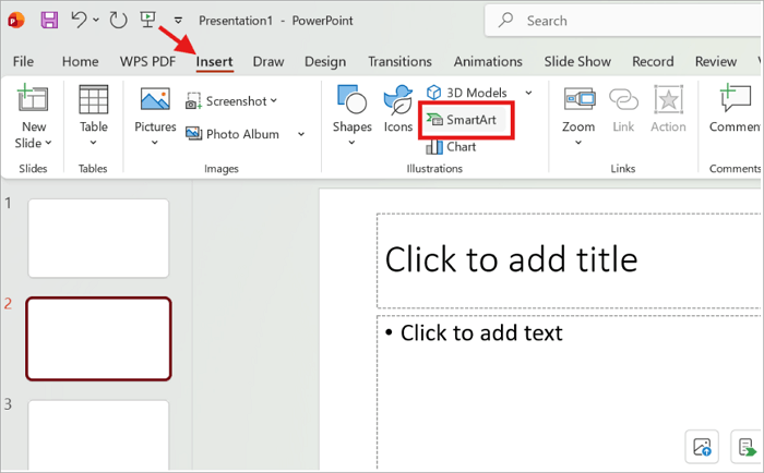
Step 2: Choose a Hierarchy Layout
Select Hierarchy from the left navigation panel. Then, choose the Organization Chart or another preferred layout and click OK.
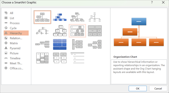
Step 3: Add Employee Names and Titles
Replace the sample text in each placeholder box with your own information.
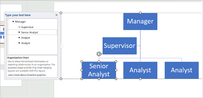
Step 4: Add More Positions
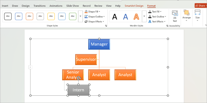
To add more positions, go to SmartArt Design > Add Shape, and choose your preferred option.
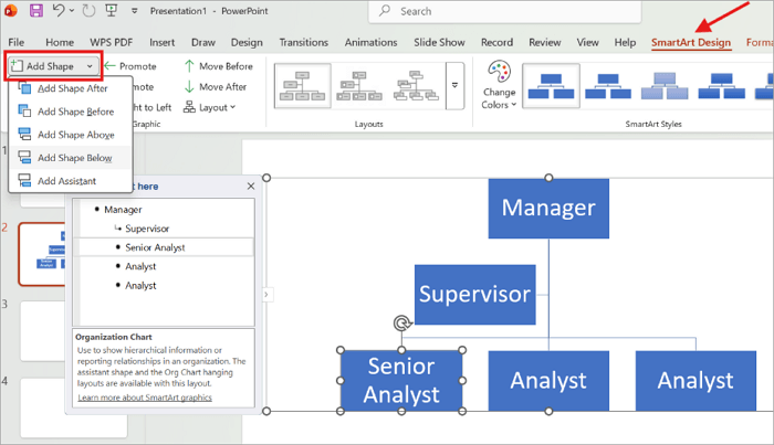
Step 5: Format the Org Chart
As soon as you complete your chart structure, move on to customize its appearance. Go to the SmartArt Design or Format tab, where you can change colors, fonts, and apply SmartArt styles.
Different Types of Org Charts You Can Create
There are several kinds of org charts because not every organization follows the same reporting structure. So before creating an org chart in PowerPoint, choose a structure that accurately represents your organization.
1. Hierarchical Org Charts
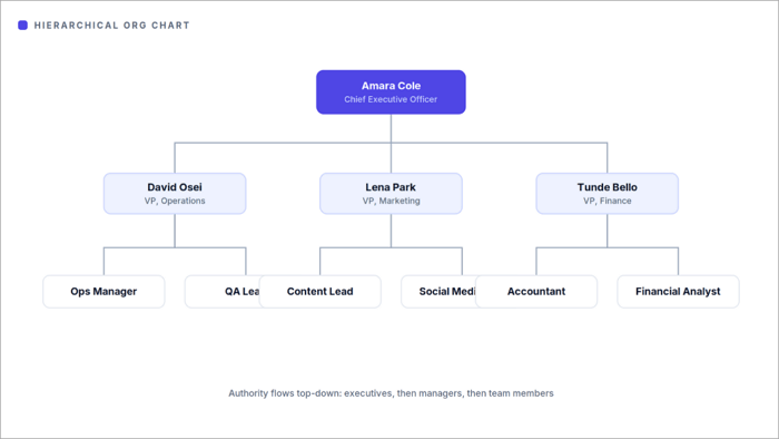
The hierarchical org chart is the most common format, and the one most people picture when they hear the term “organizational chart.” It follows a top-down structure, with senior leaders at the top, managers beneath them, and employees on the lower levels.
It’s an excellent choice for company introductions, leadership presentations, onboarding sessions, and annual business reviews.
2. Flat Organizational Charts
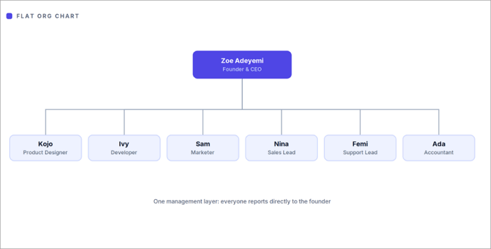
This format is quite ideal for startups, small businesses, and growing teams with few management layers. In PowerPoint, they’re ideal for team introductions, investor pitches, and company overview presentations where you want to emphasize collaboration and quick decision-making.
Instead of showing multiple levels of supervisors, the chart highlights a simpler structure where employees often work directly with founders, team leads, or department heads.
3. Matrix Organizational Charts
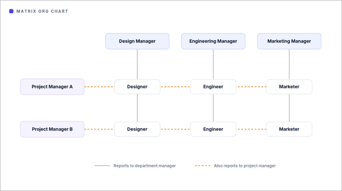
Matrix organizational charts are useful for presentations that explain cross-functional teams or project-based work. In PowerPoint, they can help show employees who report to both a department manager and a project manager, making complex reporting relationships easier for your audience to understand.
4. Divisional Organizational Charts
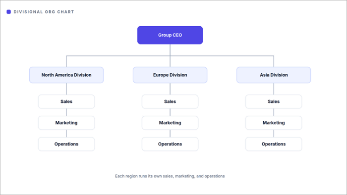
The divisional org chart format is particularly common among large organizations that separate operations into divisions, instead of managing everything from one central structure. Each division has its own leadership team while still reporting to company executives.
These charts help audiences understand how each division operates while showing how all divisions connect to the company’s overall leadership structure.
5. Team-Based Organizational Charts
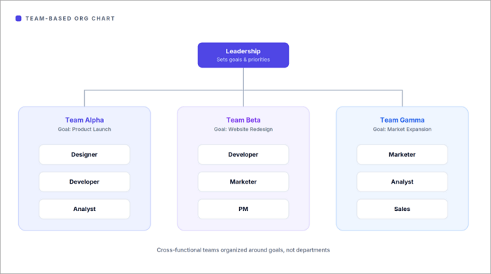
Modern workplaces now organize work around projects, and this is where team-based charts become useful. These charts highlight cross-functional collaboration instead of strict reporting relationships.
For example, you might see designers, marketers, developers, and product managers grouped on one project team, even though they belong to different departments.
Common Problems When Creating Org Charts in PowerPoint
You’ve seen how easy it is to create an organizational chart in PowerPoint. However, you may encounter some formatting issues in the process. Luckily, you can fix them quickly.
1. SmartArt Doesn’t Fit Large Organizations
You shouldn’t have a problem with SmartArt when building for small teams. However, it may become difficult to manage as an organization grows.
Rather than squeezing dozens of employees into one diagram, here are some options you can explore:
- Create one chart for each department.
- Split the organization across multiple slides.
- Use hyperlinks to connect related charts.
2. Boxes Become Difficult to Align
After adding several new positions, you may notice that boxes appear uneven or spacing becomes inconsistent.
You can easily fix this by going to Shape Format > Align to access PowerPoint’s built-in alignment tools. The options include:
- Align Left
- Align Center
- Distribute Horizontally
- Distribute Vertically
3. Reporting Lines Look Confusing
Some organizations have dotted-line reporting, temporary project managers, and multiple supervisors. But this might be difficult to understand, especially when you try to display every relationship on the chart.
Instead, focus on the primary reporting structure. If you need to explain additional relationships, mention them verbally or include them in another slide.
4. The Slide Becomes Too Crowded
One of the biggest mistakes companies make when creating org charts is trying to include every detail. This can make the chart very difficult to read. Some of these unnecessary details are:
- Employee photos
- Phone numbers
- Email addresses
- Office locations
- Long job descriptions
Usually, all you need are names and job titles. If necessary, create separate charts for different departments.
How to Build an Org Chart Faster With AI
Instead of spending time creating org charts in PowerPoint, you can adopt the use of AI tools such as AiPPT Flow to generate layouts automatically based on a prompt or organizational data. This particularly comes in handy if your organization structure changes frequently.
Some features of AiPPT Flow include:
- Presentation generation from any content source (prompt, document, or webpage)
- Flexible layouts and presentation formats
- Smart diagrams and interactive components such as charts, videos, tables, and forms
- Professional templates and reusable themes
Here’s how to create an org chart quickly with AiPPT Flow:
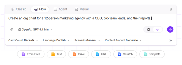
Step 1: Open AiPPT Flow and type a prompt describing your company structure. Alternatively, upload a document with the necessary information.
Step 2: Review the outline, choose a theme, and click Generate.
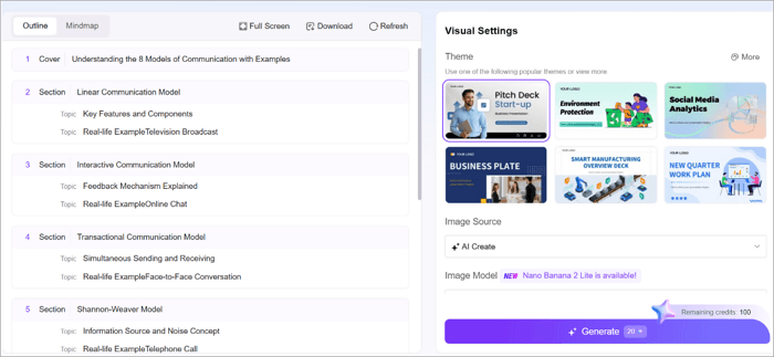
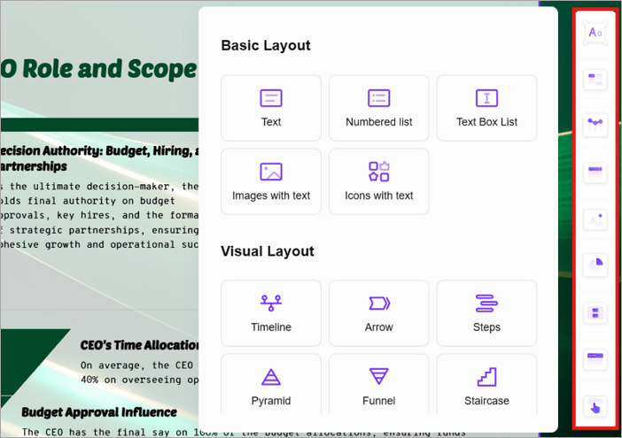
Step 3: Use the highlighted menu on the right side of the screen to select components for your org chart style.
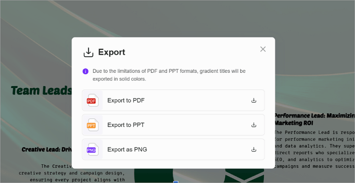
Step 4: Click Export and choose how you’d like to save your organizational chart PPT.
Conclusion
It’s impossible for any company, regardless of size, to operate without an org chart.
These charts don’t just show job titles; they clarify responsibilities, improve communication, and make onboarding much easier. This is what you should keep in mind when creating an organization chart in PPT.
Now it’s your turn to put these ideas into practice. Update your existing org chart in PowerPoint or save time by generating a professional one in AiPPT and customizing it to match your team’s structure.
FAQs on Making an Org Chart in PowerPoint
Are you creating an organizational chart for the first time? It’s okay to still have a few questions about it. Here are answers to some of the most common ones.
1. Can I use PowerPoint to create an org chart?
Yes. PowerPoint includes a built-in SmartArt feature to help you create organizational charts quickly. To use it:
- Open your PowerPoint presentation and navigate to the slide where you want the chart.
- Go to Insert > SmartArt.
- Choose the Hierarchy category and select an organization chart layout.
- Replace the placeholder text with employee names and job titles.
2. What is the easiest way to create an Organizational chart?
The easiest method is to use SmartArt in PowerPoint or an AI-powered tool. SmartArt works well for small and medium-sized organizations.
On the other hand, AI tools like AiPPT can automatically generate structured charts, saving time and reducing manual formatting. Here’s how it works:
- Go to AiPPT.com
- Type a prompt or upload your organizational structure data
- Choose your preferred theme
- Add components for building the chart
- Share or export as PPT, PDF, or PNG
3. Does Microsoft have an org chart tool?
Yes. Microsoft PowerPoint provides an Organization Chart SmartArt layout. You can also explore other products like Microsoft Visio, which offers more advanced diagramming tools for complex organizations.
Some of its features include:
- Customizable templates
- Data linking
- Automatic layouts
- Collaboration tools