Collecting good data is important, but it may not be enough if the audience cannot quickly understand what the numbers mean. This is where data presentation becomes quite useful.
It helps bridge the gap between analysis and understanding by turning findings into information people can interpret and use. Whether you are preparing a business report or a research presentation, the format you choose influences how easily your audience recognizes the main insight.
In this guide, we’ll explore what data presentation means, its main types, how to choose a format, how to present data effectively, and mistakes to avoid.
Key Takeaways:
- Data presentation turns analyzed information into a form audiences can understand and use.
- Text, tables, and graphics each serve different purposes.
- The format you choose should match your data, your audience, and your message.
- Accuracy and clarity matter more than making a chart look impressive.
What Is Data Presentation and Why Does It Matter?
Data presentation is the process of organizing and communicating data through text, tables, charts, graphs, maps, dashboards, or other formats. Its purpose is to make people understand patterns, comparisons, findings, and implications at a glance.
When data is presented to an audience properly, it helps them move beyond individual numbers and see what those numbers actually mean. It can make complex information easier to interpret, highlight important findings, and support better decisions.
Types of Data Presentation
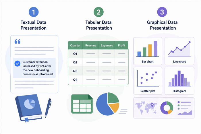
You can present data to an audience in three different formats. Each one communicates information differently, so the choice should depend on what your audience needs to understand.
1. Textual Data Presentation
Textual presentation uses short written explanations to communicate findings, context, or conclusions. It works well when there are only a few important figures or when the audience needs an explanation more than a detailed comparison.
Executive summaries, research findings, and reports commonly use this approach. For example, instead of displaying a chart for one important result, you could write, “Customer retention increased by 12% after the new onboarding process was introduced.”
2. Tabular Data Presentation
Tables arrange information into rows and columns. This is why they come in handy when readers need exact values or want to compare several variables side by side. For example, a quarterly business report might use a table to show revenue, expenses, and profit for four quarters.
3. Graphical Data Presentation
This format includes charts, graphs, maps, dashboards, and similar visualizations. They are particularly useful for revealing patterns, trends, relationships, distributions, and comparisons quickly.
A few common examples include:
- Bar chart: Compare categories.
- Line chart: Show change over time.
- Scatter plot: Show relationships between variables.
- Histogram: Show how values are distributed.
The chart you choose should align with the data structure and the message you want to communicate.
How to Choose the Right Data Presentation Format
So how do you know which format is best for presenting your data? The one you settle for will depend on your communication goal. Here are a few things worth considering:
- Purpose: What insight needs to be communicated?
- Data type: Are you showing exact values, trends, relationships, distributions, or comparisons?
- Audience: How familiar are they with the subject and data?
- Data volume: Do they need the full dataset or only the important pattern?
As a simple rule, use text for context, tables for precise values, and charts for patterns and trends. In practice, effective presentations often combine two or even all three formats. The important thing is that every element contributes to the same message.
How to Create an Effective Data Presentation
Now that you know the various data presentation techniques, let’s quickly see how you can create one yourself.
1. Start With the Question, Audience, and Key Message
Before choosing a chart, clarify what question the data should answer and what your audience needs to learn or decide. Then, organize relevant information around the purpose instead of trying to display everything you collected.
2. Organize and Understand the Data First
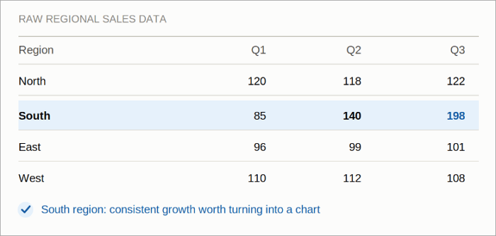
Review your data, look for meaningful patterns, comparisons, outliers, and changes, and then check whether your conclusions are actually supported.
Research presentations require additional care. Consider statistical assumptions, the suitability of the chosen test, and practical significance instead of treating statistical outputs as conclusions in themselves.
3. Choose a Visual That Fits the Data
Your chart should reflect the relationship you want to communicate, not your personal preference or the most attractive one.
A useful starting point is:
- Comparison → Bar chart
- Change over time → Line chart
- Distribution → Histogram or box plot
- Relationship → Scatter plot
Avoid using formats that imply a relationship the underlying data doesn’t actually support.
4. Build a Clear Data Story
Charts should not appear as isolated pieces of evidence. Guide the audience through a logical sequence:
Context → Key finding → Evidence → Meaning → Action
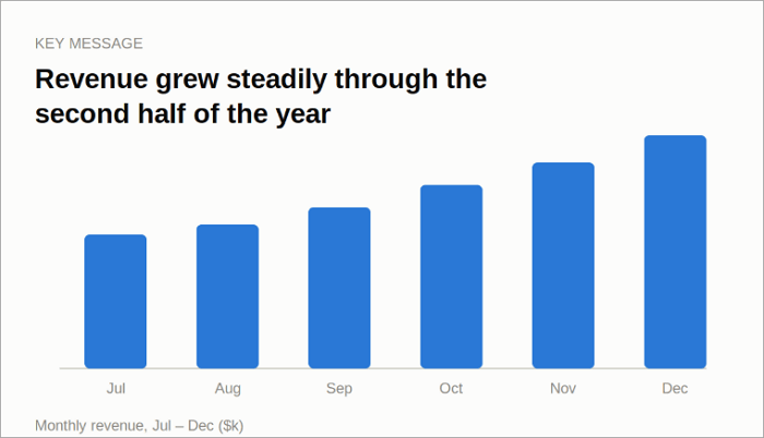
For example, rather than titling a slide “Monthly Revenue,” use a takeaway-led heading such as “Revenue increased steadily during the second half of the year” and explain what they should notice in each visual.
5. Keep Charts Simple, Accurate, and Readable
Make your charts focused by following these practices:
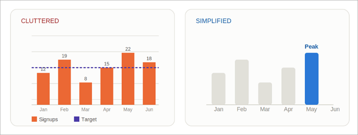
- Remove unnecessary gridlines, decorations, and labels.
- Label axes and important values clearly.
- Highlight the key data point or pattern.
- Use colors purposefully.
- Keep labels and line weights readable.
- Avoid distorting axes or scales.
- Do not rely on color alone to communicate meaning.
- Don’t simplify a chart by hiding or changing information that may affect interpretation.
How to Create a Data Presentation Using AI
AI can reduce the manual effort of turning notes, documents, and data into presentation slides. Instead of starting with a blank canvas, you can provide source material and let an AI presentation tool like AiPPT Flow organize the content before you refine the result.
AiPPT Flow helps you:
- Generate slides from prompts, files, text, or URLs.
- Keep content organized with automatic layout adjustments.
- Add more content without fixed slide-size limits.
- Refine text and visuals without repetitive manual fixes.
Here’s how to quickly create a data presentation on AiPPT Flow:
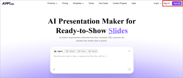
Step 1: Go to AiPPT.com to sign up, or sign in if you already have an account.
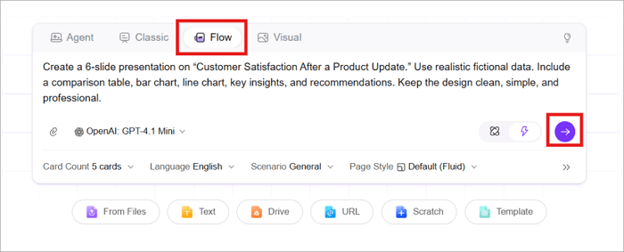
Step 2: Switch to Flow and add your content through a prompt, document, or webpage.
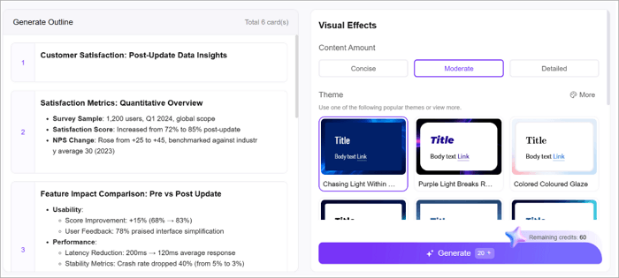
Step 3: Review the generated outline, choose a theme, and click Generate to continue.
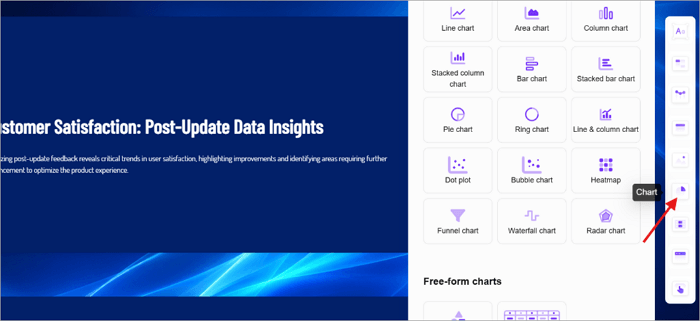
Step 4: Use the Charts menu to visualize the data with charts, tables, infographics, or smart diagrams.
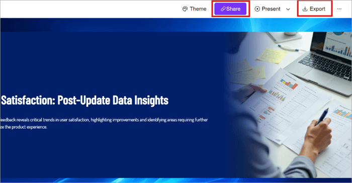
Step 5: After customizing the design, “Export” or “Share” the finished presentation.
Conclusion
Good data presentation involves more than just designing and sharing beautiful charts and graphs. It explains to your audience what the numbers you’re presenting are actually saying.
You need to understand the data, identify the key insight, and choose a format that makes that insight easy to recognize. This is what makes your presentation quite memorable for the audience.
Before creating your next chart or slide, write down the single thing your audience needs to understand. Then choose the simplest format that communicates it accurately.
Learn More About Data Presentation
The questions below cover some of the terms and approaches you are most likely to encounter when working with research findings, reports, and presentation slides.
1. What are data presentation techniques in research?
The data presentation techniques used in research help organize and communicate findings clearly. The most common ones include textual explanations, tables, charts, graphs, and other visual formats.
When choosing, go for a technique that fits the type of data, research question, and intended audience. The presentation should also represent the findings accurately without overstating their significance.
2. What are the five methods of data presentation?
The most commonly used methods of data presentation include:
- Textual → Provides context
- Tabular → Shows exact values or makes comparisons
- Charts and graphs → Reveal patterns
- Infographics or diagrams → Simplify complex information
- Dashboards → Bring multiple metrics together for monitoring
3. What is textual presentation of data?
Textual presentation of data communicates findings through words instead of tables or graphics. It works well when there are only a few important figures or when context and explanation are more useful than detailed visual comparison. Common examples include research summaries, executive reports, written findings, and business updates.