We all compare things every day, from products and software to pricing plans, business options, and even project ideas. The challenge, however, is organizing these details to make decisions easier, and that’s where comparison charts become quite useful.
With a comparison chart, your audience can easily understand the differences and similarities between multiple options by looking at a simple visual. This way, they don’t have to go through information scattered across documents, websites, spreadsheets, and reports.
💡 Key Takeaways:
- Comparison charts simplify complex decisions by presenting information visually.
- Different comparison goals require different chart formats.
- Effective charts reduce information overload while presenting data clearly.
- You can automatically generate comparison layouts with AI tools.
1️⃣ What is a Comparison Chart?
A comparison chart is a visual tool for organizing information so people can evaluate two or more options side by side and make better decisions. It includes feature tables, bar charts, matrix charts, and many more.
Take some time to explore what makes it effective in presentations.
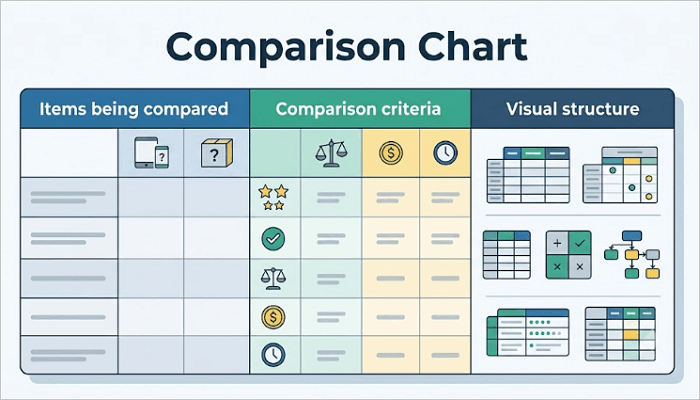
1. Main Components of a Comparison Chart
In almost every comparison chart, you’ll find:
- Items being compared: These can be products, services, candidates, ideas, software tools, or business strategies.
- Comparison criteria: Standards used to evaluate each option, such as price, features, customer support, and performance.
- Visual structure: Comparison charts arrange information in rows, columns, icons, or colors.
2. Why Comparison Charts Are Effective
They help reduce information overload. Instead of reviewing multiple documents, you can see all important details in one place and work with that.
Also, comparison charts help improve decision-making, whether you’re a student comparing research findings or an investor evaluating multiple opportunities. In addition, they allow you to save time by focusing on understanding information rather than searching for it.
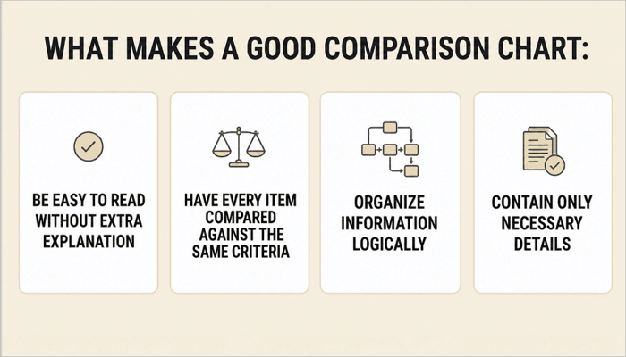
3. What Makes a Good Comparison Chart
An effective comparison chart must:
- Be easy to read without extra explanation.
- Have every item compared against the same criteria.
- Organize information logically.
- Contain only necessary details.
The goal is not to display more information, but to help your audience understand it faster.
2️⃣ Common Types of Comparison Charts and Examples
Not all comparisons require the same format. The right format or structure for a chart depends on what you want your audience to learn from the comparison.
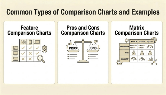
1. Feature Comparison Charts
A feature comparison chart places multiple products, services, or tools in columns, with specific features or criteria listed in rows. Each cell shows whether the item includes that feature or to what degree.
This format helps your audience quickly identify which option meets their needs, and is particularly popular in product pages, pitch decks, and technical proposals.
For example, a software company might want to compare three subscription plans using cloud storage, AI capabilities, collaboration tools, and customer support.
2. Pros and Cons Comparison Charts
As its name suggests, this chart helps people evaluate advantages and disadvantages before making decisions, instead of focusing on features alone.
It works well when trade-offs are important, such as when weighing job offers, choosing between vendors, or deciding on a business strategy.
3. Matrix Comparison Charts
Matrix charts come in handy in situations where you need to evaluate multiple criteria simultaneously. In this format, items and criteria are placed in rows and columns, creating a grid that allows you to scan horizontally and vertically.
A procurement team, for example, can use a chart like this when evaluating several suppliers across criteria such as cost, lead time, reliability, customer support, and sustainability.
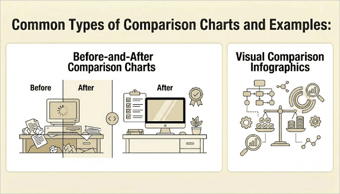
4. Before-and-After Comparison Charts
Before-and-after comparison charts work well when you want to show how something has changed over time. Rather than comparing separate items, this chart shows the same subject at two different points in time.
For example, a design agency may showcase a website redesign by displaying the original version alongside the updated version. The format is also popular in marketing case studies and performance reviews.
5. Visual Comparison Infographics
Visual comparison diagrams use icons, illustrations, and other design elements to make the comparison more engaging and easier to understand—instead of relying heavily on text.
They come in quite handy when you need to present information to audiences who prefer quick insights to detailed analysis, like in presentations, marketing materials, and reports.
3️⃣ How to Make a Comparison Table Step by Step
Every successful comparison chart you’ve come across began with a clear objective. This is something you must keep in mind when dealing with comparison tables.
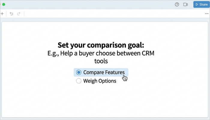
Step 1: Define the Comparison Goal
Give your chart a purpose—whether it’s to help a buyer choose between tools or show stakeholders how your company’s new pricing compares to competitors.
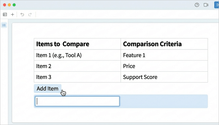
Step 2: Choose the Items and Criteria
List the items you’re comparing and the criteria you are evaluating them based on. Limit your criteria to the ones directly relevant to the goal of your comparison chart.
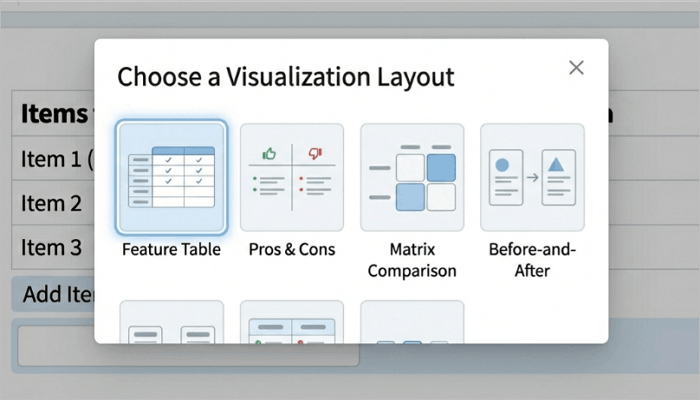
Step 3: Select the Right Chart Format
Use a feature table when comparing multiple items across many features, and a pros-and-cons format when evaluating advantages and disadvantages. The format should always match the comparison.
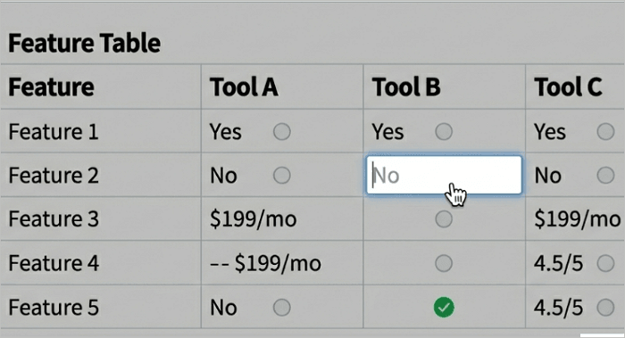
Step 4: Fill in the Data
Enter accurate, concise information into each cell. Use simple Yes/No values, short labels, or scores where possible to make the chart easier to scan.
Step 5: Format for Clarity
Use the same font, align text uniformly, and apply alternating row colors to improve readability. You can also highlight recommended options or favorable values with a subtle accent color.
4️⃣ How to Create a Comparison Graph Using AI
AI-powered presentation tools are becoming quite popular because they automate many of the tasks involved in creating comparison charts. They allow you to focus on content while AI handles the structure and formatting of your report or presentation.
AiPPT.com is one of those tools that simplifies this process. It can generate presentation-ready slides containing feature comparisons, pros-and-cons layouts, matrix comparisons, before-and-after visuals, and infographic-style comparisons.
Here’s how to create a comparison graph with AiPPT.com:
Step 1: Go to AiPPT.com and click Get Started to sign in with your preferred method.

Step 2: Describe your idea or upload content from a file, text, Drive, or URL.
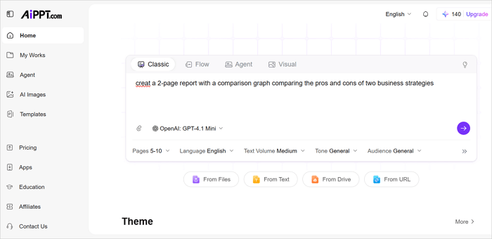
Step 3: Take some time to review the outline, select a theme, and click Generate to proceed.
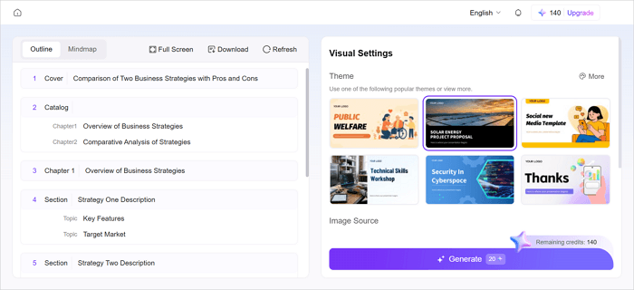
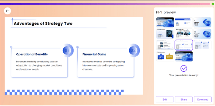
Step 4: Download or click Edit to further customize your presentation before sharing it with an audience.
Conclusion
Every important decision, such as evaluating software, presenting research findings, or selecting a business strategy, involves comparing options. Comparison charts make that important information easier to understand.
The most effective charts don’t overwhelm your audience with data. Instead, they guide them towards meaningful insights and faster decisions. Speed up the process by starting with a template or using an AI-powered presentation tool like AiPPT.com to create your comparison charts.
Learn More About Comparison Diagram
Comparison visuals come in many forms, from simple tables to infographic-style layouts. Let’s explore some questions users frequently ask about.
1. How to make a compare and contrast table?
To create a compare-and-contrast table:
- Identify the subjects you want to compare.
- List the comparison criteria.
- Create a table with the criteria in the first column and the subjects in the next column.
- Fill each cell with concise information.
- Highlight key similarities and differences with color, icons, or bold text.
2. Example of a competitor comparison chart
The competitor comparison chart below compares a company’s product with a competitor using the same evaluation criteria. This allows customers, stakeholders, or internal teams to quickly identify competitive advantages and areas where improvements may be needed.
| Criteria | Your Product | Competitor |
|---|---|---|
| Price | $25/month | $30/month |
| Free trial | Yes | Yes |
| Customer support | 24/7 | Business hours |
| Mobile app | Yes | No |
| User rating | 4.6/5.0 | 4.5/5.0 |
3. How to make a feature comparison chart?
To create a feature comparison chart:
- List the products or services being compared.
- Identify the most important features.
- Create a table structure.
- Add feature availability for each option.
- Use symbols, icons, or colors to improve readability.
- Review the chart for accuracy and clarity.