One mistake you must avoid when preparing presentations is using the wrong chart type. You should always go for one that communicates your ideas best. This is where the donut chart vs pie chart debate begins.
For decades, pie charts have been the default for presenting data, as they were more familiar and easier to read at a glance. Donut charts, however, became popular as modern presentations and dashboards needed cleaner layouts and a better way of organizing information.
This guide explores the differences between the two chart types and how to choose the best option for your audience.
1. What is a Pie Chart?
Pie charts come in several variations, each one affecting how readable and visually effective your data will be.
1️⃣ How Pie Charts Work and Their Pros and Cons
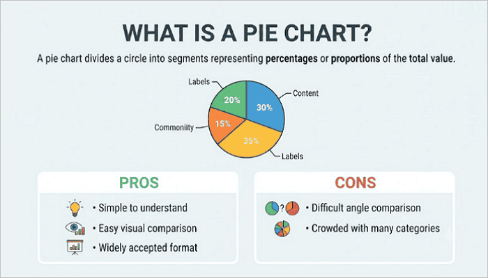
A pie chart divides a circle into segments. Each segment represents a percentage or proportion of the total value. They work particularly well when comparing a small number of categories.
✅️ Pros:
- Simple to understand: Ideal for general presentations, as most audiences recognize pie charts immediately
- Easy visual comparison: Pie charts make it easy to spot large differences between categories.
- Widely accepted format: They appear frequently in reports, presentations, and educational materials.
❌ Cons:
- Difficult angle comparison: It can be hard to distinguish among similar-sized slices in a pie chart accurately.
- Crowded with many categories: Too many slices in pie charts can make the chart difficult to read.
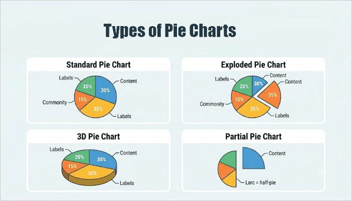
2️⃣ Types of Pie Charts
There are four common types of pie charts:
- Standard Pie Chart
This is the most common pie chart format. It consists of a plain circle divided into colored slices and works best for clean datasets with 3–5 categories.
- Exploded Pie Chart
In this format, one or more slices are separated from the chart to highlight important categories or findings. For example, showing one product line that significantly outperforms others.
- 3D Pie Chart
This version adds more depth and visual impact. However, it can make slices look larger or smaller than they are, reducing data accuracy.
- Partial Pie Chart
A partial pie chart breaks complex data into smaller sections, making the data easier to understand.
2. What is a Donut Chart?
A donut chart features a hollow center that improves layout flexibility and information density, but readability still depends on good design choices.
1️⃣ How Donut Charts Work and Their Pros and Cons
Like pie charts, donut charts show parts of a whole using circular segments. The difference between pie chart and doughnut chart, however, is the empty center.
This center space can display totals, percentages, KPI values, or summary information, making donut charts especially useful in business dashboards.
✅️ Pros:
- Modern appearance: Donut charts work well with contemporary presentation and dashboard designs.
- Better space usage: The hollow center area in a donut chart can display valuable information.
- Dashboard compatibility: You can neatly arrange multiple donut charts into tight grid layouts, such as a reporting interface.
❌ Cons:
- Small slices can still be confusing: Like pie charts, too many narrow segments in a donut chart can be difficult to follow for your audience.
- Too many categories reduce clarity: The arc format in a donut chart doesn’t scale well for too many categories. Consider a bar chart if you’re plotting more than 5 segments.
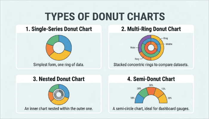
2️⃣ Types of Donut Charts
Here are four different formats you can use when creating donut charts:
- Single-Series Donut Chart
This is the standard donut chart version most users recognize, consisting of one ring and one dataset.
- Multi-Ring Donut Chart
In this format, multiple rings are used to compare datasets, with each ring representing a different dataset or time period.
- Nested Donut Chart
This is similar to the multi-ring, but focused on hierarchical data. It works well for grouped datasets with natural parent-child relationships.
- Semi-Donut Chart
The semi-donut chart displays only part of the circle, helping save space in dashboards, and is suitable for modern UI design.
3. Difference between Pie Chart and Doughnut Chart
To better understand the pie chart vs donut chart debate, you need to explore the factors that actually matter when you’re building a slide or dashboard.
1️⃣ Structural Differences
The most obvious distinction is the center area of both charts. Pie charts use a solid circle, while donut charts have a hollow center.
This changes label placement. For example, pie chart labels often go inside slices (which can get crowded), while donut chart labels tend to sit outside or in the center. Also, the hollow center of donut charts creates breathing room that makes the chart feel less dense, especially in tight layouts.
2️⃣ Data Readability
Another factor to consider when comparing pie and donut charts is readability. Both charts often struggle when displaying many small categories.
However, donut charts can sometimes improve readability because the thinner ring allows you to position labels more effectively. Pie charts, on the other hand, may become difficult to interpret when your audience wants to compare similar-sized angles.
3️⃣ Information Density
Donut charts often outperform pie charts in organizing information. The center space of a donut chart can display:
- Total values
- KPI metrics
- Summary statistics
- Performance indicators
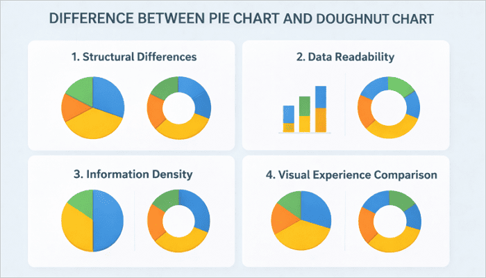
4️⃣ Visual Experience Comparison
Pie charts carry a traditional, report-style look, making them fit well in academic papers, formal business reports, and classic presentation templates. Donut charts, however, feel more modern and minimalist.
Many infographic designers prefer donut charts because they integrate well with other visual elements and support cleaner layouts.
| Feature | Pie Chart | Donut Chart |
|---|---|---|
| 1. Visual style | Traditional | Modern, minimalist |
| 2. Readability | Good for a few categories (3–5 slices) | Good with proper labeling |
| 3. Space efficiency | Moderate | High |
| 4. Information density | Limited (No center space) | Higher (Usable center space) |
| 5. Best use cases | Simple reports | Dashboards, KPIs, reports |
4. When to Use a Pie Graph and When to Use a Donut Chart
The chart type you use in a presentation or report usually comes down to the complexity of your data, your audience, and the layout.
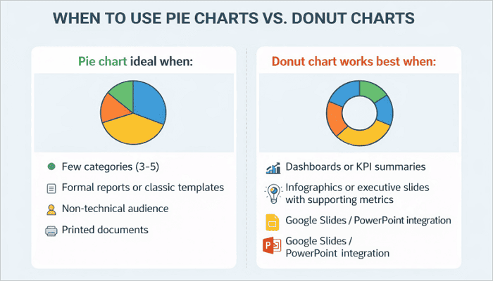
💡 A pie chart is ideal when:
- Your dataset has a few categories (3–5).
- You’re working on a formal report or a traditional slide template.
- Your audience is non-technical.
- Creating printed documents where screen resolution isn’t a factor.
💡 A donut chart works best when:
- You’re designing a dashboard, KPI summary, or a modern presentation.
- Creating infographics or executive summary slides with a supporting metric in the chart.
- Working with tools like Google Slides or PowerPoint, as the chart integrates more cleanly.
If you’re working with crowded datasets, however, neither option may be ideal. In such cases, bar charts are recommended as they often provide better readability.
5. How AiPPT.com Simplifies Chart Design
Building slides with the right chart shouldn’t require manual reformatting every time your data changes.
AiPPT.com is an AI-powered presentation tool that helps you generate and customize chart-based slides quickly—whether you need a donut chart for a KPI summary or a pie chart for a simple breakdown.
Here’s a simple workflow for creating chart designs on AiPPT.com:
- Open AiPPT.com and start a new presentation or select a template.
- Describe your slide content or upload your data in any of the supported formats.
- Customize the chart using AiPPT.com’s editing tool.
- Export to PowerPoint or Google Slides.
Conclusion
Choosing between a donut chart and a pie chart design depends on how much information you need to communicate and how your audience will comprehend it.
Pie charts work well for quick, simple comparisons. But if your presentation, report, or dashboard needs extra context or supporting numbers, donut charts give you more room to work with.
Before creating your next presentation, review your data structure first. Then select the chart format that makes the message easiest to understand for your audience.
FAQs: Donut vs Pie Chart
These questions come up often when working with donut and pie chart types in presentations and dashboards.
1. What is the meaning of a rounded chart?
A rounded chart generally refers to any chart that uses a circular shape to represent data. Pie charts and donut charts are the most common examples. These charts help visualize how different categories contribute to a whole by dividing the circle into proportional segments.
2. What are the 4 types of graphs?
The four most common types of graphs are:
- Bar graphs
- Line graphs
- Pie graphs (including donut charts)
- Scatter plots
Each of these graphs serves a different analytical purpose. For example, bar graphs compare categories, line graphs show trends over time, pie graphs display part-to-whole relationships, and scatter plots reveal correlations between two variables.
3. Is it a pie graph or a pie chart?
Both terms are widely used and generally mean the same thing. However, “pie chart” is the more common and technically preferred term in business reporting, academic materials, and presentation software such as PowerPoint and Google Slides.