Your use of colors in a presentation does more than just look good. With a strong PPT color palette, your presentation becomes more readable and professional. Also, since color is associated with emotions, it can influence your audience.
A presentation may have great content but still fail to make the impact you want because it looks messy, outdated, or difficult to read. In most cases, color is usually the reason.
This guide addresses those frustrations and shows you how to make color work in your favor when creating presentations.
⭐ Key Takeaways
- Good palettes depend on contrast and consistency, not the number of colors used.
- Learn which 2026 palette styles work best for specific presentation contexts.
- Each section guides you toward matching your color choices with your presentation goals.
- How to avoid color combinations that damage readability.
1️⃣ Why PowerPoint Color Combinations Matter
Colors influence how your audience experiences your presentation right from the first slide. Strong PowerPoint color combinations help separate important information, make data easier to interpret, and improve the overall presentation experience.
Different colors also carry different associations. For example, blue and gray signal trust and professionalism, while warm tones like orange and red create energy and urgency. While these associations are not fixed, they influence what your audience thinks about a presentation.
This is why you must be intentional about colors to ensure that they match the tone of your message.
2️⃣ Principles for Choosing a Color Palette for Presentations
Modern presentation design is becoming simpler and more usability-focused. Here are some principles when selecting a color palette for presentation today.
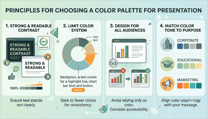
1. Keep Contrast Strong and Readable
Ensure that text stands out clearly from the background. Dark text on light backgrounds remains one of the safest choices. If you use dark backgrounds, pair them with bright text.
2. Limit your Color System
To create consistency, stick to a few colors, including a dominant background tone, one or two text colors, and one accent color for highlights, charts, or buttons.
3. Design for All Audiences
Avoid relying only on color to explain information. For example, color-blind viewers may have an issue with red and green combinations.
4. Match Color Tone to Purpose
For example:
- Corporate reports often use blues, grays, and muted tones.
- Educational slides work well with softer colors.
- Marketing presentations may use brighter accents for energy.
3️⃣ Best PowerPoint Color Palettes for 2026
While trendy palettes may look quite impressive, you shouldn’t copy them blindly. When choosing color combinations for PPT, always go for options that remain readable and fit your message.
1. Professional Business Palettes
Professional and business presentations usually favor deep neutrals and clean accent colors. The recommended color palette includes:
- Navy blue
- Charcoal
- White
- Muted blue accent
This palette works quite well for corporate presentations, investor decks, board reports, and consulting deliverables. The combination signals competence and trustworthiness, which are qualities that matter most in professional situations.

2. Modern Minimal Palettes
Minimal designs help reduce visual clutter. The recommended color palette includes:
- Off-white
- Dark charcoal
- Single bold accent
- Sage green
Instead of being noisy, it helps focus attention on the content, making it ideal for several contexts, including startup pitch decks, portfolio presentations, and internal team updates.

3. Creative Bold Palettes
Stronger colors can command energy and attention in presentations. When you know how to create balance, you only need a dominant dark background, a bright primary color, and a secondary accent.
The recommended color palette includes:
- Deep violet
- Electric yellow
- White
- Coral accent
These combinations work well for product launches, marketing campaigns, brand storytelling, and keynote presentations where energy and excitement are part of the message.

4. Soft Educational Palettes
Whether for school, training sessions, or e-learning modules, educational presentations tend to run longer. Warm neutrals and soft tones help reduce visual fatigue during these prolonged sessions.
The recommended color palette includes:
- Warm cream
- Soft brown
- Dusty blue
- Light sage
This palette avoids extreme contrast to keep slides readable. The overall effect is approachable and calm, helping learners stay focused rather than distracted by the visuals.
4️⃣ How to Choose the Best Colors for a PowerPoint Presentation
Instead of copying random templates, it is better to understand how color decisions actually work. The process below walks you through how to select colors effectively.
Step 1: Understand Your Audience Context
Consider who will be in the room or watching your presentation. The color palette should feel natural to your audience, not surprising.
Step 2: Match Colors With Message Tone
Ask what emotional register your presentation needs. Is it reassuring? Energetic? Authoritative? Each of these maps to a different palette family.
Step 3: Check Readability in Real Conditions
Always preview your slides in full-screen mode. If they will be projected, check them in a similar environment, as colors may look different under projector light. For example, contrast appears lower, and bright colors can bleed or wash out.
Step 4: Test Before Finalizing
Build two or three slides using your chosen colors and review them as a slideshow rather than in editing view. This forces you to see what the audience will see.
5️⃣ AiPPT Templates With Professional Color Combination for PPT
AiPPT.com reduces the trial and error that goes into selecting color combinations for PPT by providing thousands of professionally designed templates with pre-balanced color schemes.
Simply pick a beautiful template based on your occasion or topic in AiPPT.com. No need to choose colors from scratch or worry about design. Start from a pre-matched template, then customize it—adjust the color tones, change the layout or images, and easily bring your vision to life.
The tool comes in particularly handy when you have limited time or do not have a design background.
You can combine these templates with other helpful tools like accessibility contrast checkers or online palette generators to improve how your presentation looks and feels.
Conclusion
Your choice of colors matters because audiences need to understand your message quickly and comfortably. A strong slide design helps support this message without distracting from it.
The right PPT color palette usually goes unnoticed by the audience, and that should be your goal. When colors are balanced correctly, viewers focus naturally on the ideas being presented instead of the design itself.
If you are unsure where to start, reduce an existing presentation to three colors: one background, one text color, and one accent. Then, see whether that constraint makes the deck feel cleaner.
FAQs on PowerPoint Color Palette
Many users still struggle with selecting presentation colors effectively. These quick answers can help simplify the process.
1️⃣ What are the best color schemes for presentations?
The best color schemes for presentations usually depend on context. For example:
- Corporate settings: Navy and white with a single muted accent.
- Creative work: Bold contrast palettes with one dominant background and one bright accent.
- Educational content: Warm neutrals like cream and soft brown.
2️⃣ How to choose colors that would look good in a slide presentation?
Here’s a step-by-step guide to choosing colors in a presentation:
- Identify your audience and the tone your message requires.
- Pick a background, one or two text colors, and one accent.
- Test the combination in slideshow mode.
- Check it in the environment where it will be presented.
3️⃣ What are the most popular PowerPoint color schemes?
The most popular PowerPoint color schemes in 2026 include:
- Navy and white for corporate decks.
- Off-white with a single earthy accent for minimal modern styles.
- Deep violet or midnight blue with electric highlights for creative presentations.
- Warm neutrals for educational content.