For analysts, students & business teams

Data Analysis Presentation Template + AI Generator

Create a clear data analysis presentation in minutes. Use the AI data analysis presentation generator to organize your question, sources, methods, charts, comparisons, findings, uncertainty, limitations, and recommendations.Build data analysis slides from sources, methods, charts, findings, and recommendations with AI.

Browse Templates
Data quality and methodsCharts and comparisonsFindings and decisions
Report PPT on Market Research and Analysis
Question-to-insight slide flow
AI-assisted analysis copy
Editable data templates
Export data analysis PowerPoint

Related data analysis presentation resources

How to create a data analysis presentation

  1. Define the decision, audience, analytical question, population, time period, scope, and success criteria.
  2. Document data sources, ownership, sampling, joins, definitions, cleaning, missingness, and quality limitations.
  3. Select appropriate descriptive or inferential methods and compare results with a meaningful baseline.
  4. Build charts that state units, denominators, time ranges, uncertainty, and one clear takeaway.
  5. Separate evidence from interpretation, acknowledge limitations, and finish with an actionable recommendation.

Example sections in your data analysis presentation

  • Decision context, analytical question, scope, baseline, and key definitions.
  • Source inventory, sampling, data model, cleaning rules, and quality assessment.
  • Descriptive statistics, trends, distributions, segments, and comparative analysis.
  • Key findings, uncertainty, sensitivity checks, anomalies, and alternative explanations.
  • Limitations, recommendation, expected impact, owner, and monitoring plan.

Choose your data analysis presentation format

Business Performance Analysis

Applicable to:

Quarterly reviewsOperations reportingExecutive decisions

Connect revenue, cost, customer, and operational metrics to trends, drivers, risks, and recommended actions.

Market Research Analysis

Applicable to:

Customer surveysCompetitor studiesMarket sizing

Present sampling, segments, preferences, market evidence, uncertainty, implications, and a defensible go-to-market decision.

Scientific Data Analysis

Applicable to:

Laboratory studiesField researchAcademic projects

Explain measurements, methods, distributions, tests, uncertainty, findings, limitations, and evidence-based conclusions.

Dashboard Insights Report

Applicable to:

Product analyticsMarketing analyticsService monitoring

Turn dashboard metrics into a focused narrative of change, drivers, anomalies, impact, and next actions.

Example data analysis presentation

What makes a data analysis presentation effective

  • Every metric states its definition, unit, denominator, time range, source, and relevant comparison.
  • Charts match the data type and make one evidence-based takeaway easy to verify.
  • Sampling, missingness, uncertainty, sensitivity, and alternative explanations are disclosed.
  • Recommendations follow directly from findings and include an owner, action, and monitoring measure.

Common mistakes

  • Starting with charts before defining the decision, scope, population, and metric rules.
  • Using totals or percentages without denominators, baselines, time periods, or source context.
  • Treating correlation as causation or hiding data quality problems and inconvenient segments.
  • Ending with observations but no prioritized recommendation, owner, or follow-up measurement.

Frequently Asked Questions

Include the question, scope, source data, cleaning, methods, descriptive results, charts, comparisons, findings, uncertainty, limitations, and recommendations. Make every important number traceable to a definition and source.
Most project or business reviews work well with 8 to 15 slides, while a short executive update may use 5 to 7. Spend more space on findings and decisions than on background or tool descriptions.
Use lines for change over time, bars for category comparison, scatterplots for relationships, histograms or box plots for distributions, and carefully labeled tables for exact values. Avoid pie charts when many categories or small differences make comparison difficult.
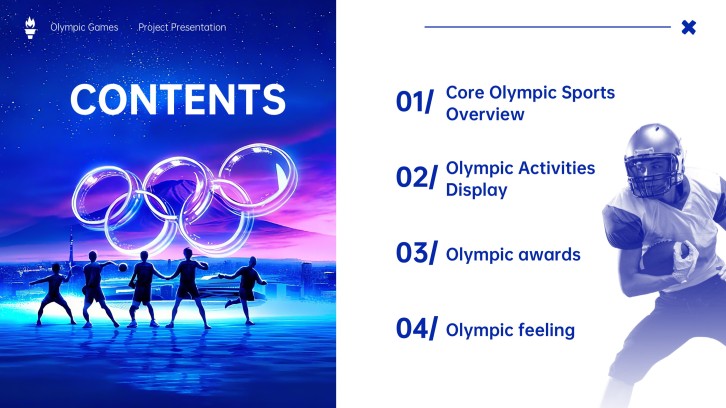
A strong example defines a decision, documents data quality, uses appropriate comparisons, makes uncertainty visible, and ends with actions supported by evidence. The Olympic example above demonstrates a consistent story across participation, events, medals, and representation.
AI can organize notes, suggest an outline, condense explanations, and create a starting presentation structure. You should still verify calculations, data sources, chart labels, statistical interpretations, confidentiality, and recommendations.
Yes. Choose a relevant template, generate a starting deck, and replace the draft with your own sources, methods, charts, findings, citations, limitations, and recommendations.
AI Presentation Maker

Generate your data analysis presentation now

Turn your data sources, methods, charts, findings, and recommendations into a structured data analysis presentation with AI.